A few months ago, Benn Stancil wrote about the eternal spreadsheet. While I appreciated the generous shout out to both mdsinabox and motherduck (my employer), this really got the wheels turning around something that I have been feeling but have only been able to put into words recently: are BI tools transitory?
Consider the following scenario in the Microsoft stack: ingest data with ADF, transform with Fabric (& maybe dbt?), build a semantic model in Power BI, and delicately craft an artisanal dashboard (with your mouse). Then your stakeholder takes a look at your dashboard, navigates to the top left corner and clicks “Analyze In Excel”. How did we get here?
I remember back in the 90s, hearing my dad talk about “killer apps”. The killer app was the app that made your whole platform work. If you wanted your platform to be adopted, it needed a killer app so good that users would switch their hardware and software (an expensive proposition at the time) so they could use the killer app. In my lifetime, I recall a few killer apps: The App Store (iOS), the web (Internet), and Spreadsheets (personal computing).
Spreadsheets allowed a user to make an update in one place and for the data to flow to another place. If this concept seems oddly like a directed-acyclic graph (DAG), that’s because it is. These spreadsheets contain a bunch of features that we find handy in the data solutions stack today: snapshots (save as), version control (file naming), sharing (network shares & email attachments), business intelligence (pivot tables & charts), file interoperability (reading csv, json, xml etc), transformation (power query (there was an earlier, even more cursed version too)). All of these pieces have obvious metaphors in the commonly used data stacks today. Critically, one piece is missing: orchestration (note: back in mid 2010s, I used and loved an excel plugin called “Jet Reports” that included an orchestrator, among other things).
Now if you were running a business in the 90s (like these guys), there was no need for orchestration in your spreadsheet. You, the business user, were the orchestrator. Your data came from many places – memos (later, emails), research (books, later pdfs), a filing cabinet (later, databases), phone calls (later, slack), meetings (later, zoom calls), and your own synthesis (later, chatGPT (just kidding)). Software could not contain these! We did not have the digital twins for these analog processes. In some ways, the spreadsheet was the perfect digital collection point for these physical artifacts.
As each of these parts of our business decision making input processes transitioned to digital, our poor spreadsheet began to fall out of favor. We replaced memos with emails, phone calls with IM (via skype, if you are old enough to remember), and so on. And these digital processes began to produce loads of data. Every step produced an event that was stored in a database. The pace of change in the business environment increased in-kind. Our once per month spreadsheets orchestrated by humans were a bit too slow, processes produced too much data to be aggregated by humans. I fondly recall the launch of excel 2007, which included a new architecture and file format, so that we could process one million rows instead of only 65,536.
Unfortunately, the hardware at the time could not actually handle one million rows. Every single person using excel, unencumbered by 32bit row limits, ran into the hard limits of the Excel architecture and inevitably seeing a spinning, “waiting for excel” icon before crashing (hopefully you saved recently). Hilariously, Microsoft trained users to tolerate an absolutely terrible experience. Excel could do too much. What we needed to do was unbundle this tool, take it apart piece-by-piece, so that we could have good, delightful experiences for our business users. Users could still use spreadsheets for things, but we needed to shift the load bearing intelligence of our business decision making into better tools.
So we built even more powerful databases, and ways to automate decision making at scale. We began to use multiple computers, running in parallel, to solve these problems for us. Large complex systems like Hadoop were required to aggregate all this data. Companies like Google harnessed the immense scale enabled by these systems to become the largest in the world, building never-before-seen products and experiences.
At the same time, CPU clock speeds stopped increasing. We had maxed the number of cycles we could push out of the silicon in the fabs. But innovation found a way to continue – we began to add more cores. Slowly but surely Moore’s law kept on holding, not on clock speed but on throughput.
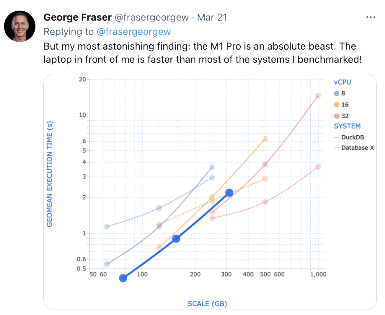
The software built to take advantage of the scale that was possible with huge quantities of networked computers made assumptions about how to work at great scale across many machines (i.e. Spark). These assumptions did not generalize to single machines with many cores. This has not been unnoticed, of course (see George’s tweet).
So what happened to our business intelligence while this was going on? The number of tools exploded, while the consumption interface remained unchanged. Categories were split into sub-categories into sub-categories. We only had so many charting primitives, and whether we dragged and dropped with Tableau or used BI as code in Evidence, the output looked largely the same. But instead of one tool that we needed in the 90s, we now had thousands.
But I would argue we haven’t added anything new, we’ve merely unbundled it into a bunch of different products and that don’t work that great together. REST APIs have allowed scalable, loosely coupled systems but really suck to work with. Behind every large enterprise data workflow is an SFTP server with CSVs sitting on it (if you are lucky, its object storage and a compressed format, but its the same thing).
If we look at the trends, in 5 years we will have approx. 10x more compute than we do today, and Backblaze estimates that cost per GB of storage will stabilize around 0.01 / GB ($10/TB). If these trends hold, we will easily have enough horsepower on our laptops to put all these pieces that we have decoupled over time, into one box. If BI tools are transitory, spreadsheets are eternal. The era of spreadsheets 2.0 will be upon us.
What are the characteristics of Spreadsheets 2.0?
- Runs on a single node with many cores (hundreds?)
- One file format for handling all types of data (xlsx++)
- One language for end-to-end data manipulation (sql)
- A spreadsheet UI for interacting with data at any step in the data manipulation (power query-ish)
- Fast, interactive charting (mosaic)
- Intelligent, incemental orchestration (dynamic dags)
- An AI trained on all these parts above to assist the user in documentation, understanding, and building (clippy but good)
I believe the first building block of this has emerged in front of our eyes: DuckDB. The hardware is being built as we speak (the feedback loop will build it whether we like it or not). Julian Hyde is advocating for “completing the SQL spec to handle metrics” (with apologies to Malloy) – humans have refined this language over the last 50 years and will continue to do it for the next 50. We already have the UI primitives (Excel), so we merely need to bolt these together.
It’s time for the humble spreadsheet to RETVRN. It’s time to bring humans back into the workflow, empowered by AI, to own the data ingestion, transformation, and synthesis required to make decisions. Of course, I’m tinkering with this idea today, if you are interested in what I have so far, please reach out, I would love to talk.