Connect Snowflake to Excel in Minutes

Data “Self-Serve” is a buzzword that’s managed to stick around for a long time without a solution. However, I’m convinced that we can get partway there with simple data products rooted in familiar tools. One ubiquitious tool? Excel. Nearly everyone uses spreadsheets or similar productivity tools at work.

That leads me to meet stakeholders where they’re at: in Excel. And modern data warehouses like Snowflake make it really easy to do so. It’s an easy win if you’ve invested in Analytics Engineering to create clean datasets in your database. Let’s bring those datasets to your users.

Here’s how to connect Snowflake into Excel and enable live connections pivot tables in minutes. These are instructions for Windows specifically.

Step by Step Instructions

(1) Install the ODBC Driver

Click on the “Help” button in the Snowflake UI, go to “Download…” and select “ODBC Driver” and “Snowflake Repository”. Install from the file that downloads.

(2) Configure ODBC Driver

Go to your start menu and type in “ODBC” and click on ODBC Data Sources (64 bit)

Under User DSN, select Add…

Select SnowflakeDSIIDriver from the menu

Fill in the boxes as follows – though your individual situation may vary. My example uses SSO when an organization doesn’t allow direct usernames/passwords for Snowflake. Lots of options here and Snowflake has full documentation of options here.

Note: I found that lots of databases & schemas are available even after choosing some here. Not sure the full limitations, so you can play with options. I put all options in for the primary database I cared about and it worked fine.

Click on Test… to confirm it worked. Here’s the dialog if it did:

(3) Connect to database in Excel

Open Excel and go to the Data tab, click on Get Data and choose From Other Sources and pick From ODBC

From the window that pops up, pick the Snowflake connection and select OK

If successful, you’ll see a window with a dropdown showing your available databases. Use that dropdown to pick the database you want.

IMPORTANT: There is an easy way to load data directly into a Pivot Table at this point (thanks Jacob for this tip!) which will save you and teams time.

Once you select the database / schema / table you want, go to that “Load” button on the bottom and click the little down arrow next to it. Choose “Load to…”

The next menu that pops up will give you various options – pick the second one down saying PivotTable Report

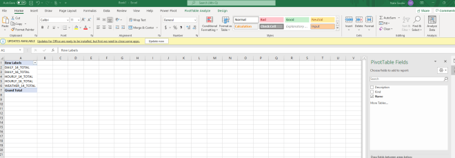
DONE. You’re there. The data is now connected live to Snowflake and is available to pivot. I used Snowflake’s sample “Weather” table which I just learned has basically nothing in it, but that’s besides the point.

Parting notes

There are a couple interesting tidbits to pass both to your stakeholders as well as anyone concerned about Snowflake compute cost & data security.

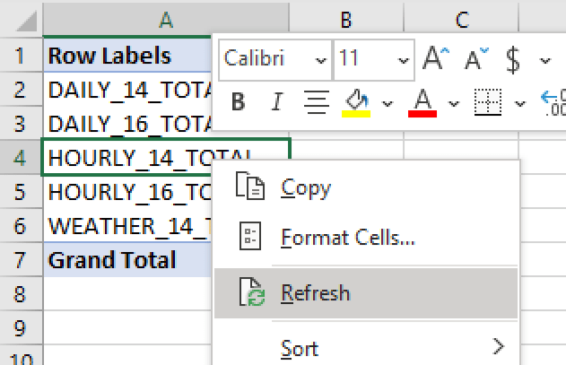
(1) Stakeholders can refresh data live from Snowflake any time. By right-clicking the pivot table and selecting “Refresh”. No more stakeholders asking you for the latest data – they can just get it anytime.

(2) Data is cached on the local machine, reducing compute costs & keeping things snappy for stakeholders. This satisfies worries from both stakeholders on performance (it’s REALLY snappy, even for huge tables) as well as those concerned on cost (compute only happens on refresh).

That’s it! Just a few installations and clicks and you’ve connected Snowflake live into Excel for any stakeholder. Happy self-serving.

Start Simple With Your Analytics Project

Start Simple & Iterate

Up to this point, I’ve largely written for those looking to break into an analytics career. Today I’ll go beyond that and discuss the most powerful lesson I and many others learned — something I wish I fully understood starting out:

Start your analytics project as simple as possible and iterate from there.

This strategy borrows a lot from Agile software development not because I’m a student of it, but because I learned the values of Agile through trial and error. Only after I stumbled upon this strategy did I learn how closely it aligns to the Agile methodology.

The Common Mistake

I’m going to assume you’ve already solved the toughest issue in analytics: identifying an ambiguous problem. Congrats! Now you need to figure out how to make it happen. This is where things can go wrong.

Many analysts (myself included!) are then tempted to:

  • Retreat to your office
  • Gather & clean all the data you think everyone needs
  • Build the World’s Best V1 Dashboard
  • Schedule a meeting to present the dashboard
  • Receive unanimous praise for how amazing it is
  • Watch as everyone uses your dashboard daily

What really happens:

  • Retreat to your office
  • Gather & clean only some of the data people need
  • Spend way too long building the Dashboard No One Really Wanted
  • Stakeholders email you intermittently asking if you’re making progress
  • Schedule a meeting to present the dashboard
  • Entire meeting spent fielding questions like “Why don’t I see X or Y?”
  • Get the cold sweats realizing you don’t have what they need
  • Stakeholders frustrated that so much dev time was wasted
  • You’re frustrated that they are “changing what they need”
  • Retreat to your office

Why Does This Happen?

Every data analyst/scientist makes this mistake. It will continually happen throughout your career, even after you think you’ll never make that mistake again. No one is immune.

There is one core reason why this happens: You assume you understand what the stakeholder wants.

Except you likely don’t. Especially when you’re early in your career. You’ll think you’re on the same page with your stakeholder, but you aren’t. You think you know what data points the stakeholder needs, but you don’t (hint: the stakeholder likely doesn’t know either!). You think you know what kind of visuals the stakeholder will find most useful, but you don’t.

In fact, it’s so difficult to get everything right the first time, you should assume you don’t fully understand the request. That one time you actually do build “The World’s Best V1 Dashboard”, celebrate the unexpected success – it won’t happen often.

Strategy: Start Simple

There’s a solution to this problem: Start your analytics projects as simple as possible. This results in less wasted time in development and happier stakeholders at the end. The process looks like this:

  • Agree with stakeholder on an MVP (Minimum Viable Product) – something small that can be done quickly
    • Your stakeholder may not know exactly what they want, so you may have lots of freedom here
  • Gather & clean only the data you need for the MVP
  • Create MVP dashboard
    • Ask your stakeholder questions here, too! You don’t need to go radio silent and many times they’ll appreciate the feedback loop
  • Present MVP dashboard to stakeholder
  • Gather feedback from stakeholder
  • Start process over again

This process is designed to be quick, with small iterations should building on each other until everyone agrees the dashboard fits the needs of the business. The more interactions with stakeholders the better – you’ll quickly identify misalignments, missing data, new requirements, changing business needs and more.

The advantages should be clear. Stakeholders will feel ownership over a product they helped develop (leading to better adoption!). The end product will be closer to what the business needs (leading to better adoption!). And stakeholders will remember the success of the project and give you a call for the next one.

Conclusion

Don’t try to build Rome in a day on any analytics project. You’ll rarely succeed. Instead, iterate and build on a project until it becomes something useful – and likely looks nothing like what you thought it would starting out.

Analytics is a dynamic field. Don’t fight upstream with how quickly things change; set up your work process to allow for quick changes. Your company & future self will thank you.